Friday, 19 December 2008

Influences


Some genres i would like to consider for influences to my new music magazine would be rock, rock and roll, metal and blues. Some different magazine influences would be Kerrang, Q and the NME as those magazines are the ones which usually contain all of those genres i have specified. Also being a guitar player myself is a factor in what would influence my ideas and style of my new music magazine. I have a wide range of taste in music which is an advantage when creating my music magazine as it would allow me to explore different genres in more depth. AC/DC, The Beatles, Michael Jackson and Avenged sevenfold are all examples of my taste in music.
Although my favourite music magazines of all are guitar magazines such as Total Guitar, Guitar World etc. This is the type of magazine i am considering producing as i have a lot of knowledge in this certain field.
The publisher of Total Guitar is Future Publishing. I am going to research Future Publishing in more detail comparing them with some other publishers such as IPC Media the publishers of NME

New music magazine

I am going to produce a completely newly branded music magazine front cover, contents page, and double page spread. I will be creating my double page spread on an A3 landscape and my front cover and contents page on A4. I will also be using at least four original images i have took myself. At the moment i have a basic idea of what i want to do, however i would like to research and expand on other ideas to see which i like the best and to also give me a deeper insight into other music magazines. Personally i am very excited to be creating a new music magazine as i love music and it also gives me the chance to express myself through many different creative aspects and forms

Sunday, 30 November 2008

Contents Page


This is my mock up of a contents page for my magazine ''Frets''

I used a graphic border around the right hand side, found from the Internet to give the piece more depth and quality. I inserted a Wyke logo and a picture of the Wyke Principal to emphasise the fact it is a college magazine. Also the layout contains many futuristic and different elements and factors which show off the magazines unique qualities.

The text fonts i have used are very unique and alternative which is a great asset to the piece as a whole as it shows that its different, well thought out and ready to rock.
I am relatively pleased with it as it uses a creative layout and interesting mark making and line techniques within the fonts and the graphics surrounding them.
However simple it may look it still manages to be very effective in upholding an eye catching page. This would fit in very well with the front cover as it merges in with the guitar theme and also possesses interesting shape and design much like the front cover.


Friday, 21 November 2008

Final outcome and Evaluation

This is my finished magazine cover which i am relatively pleased about.
I love how all the different elements come together to create an interesting and creative cover which fits in well with the theme of wyke and music. I really love the font which i have used as it seems to be quite professional and also unique to most other magazines, this in turn would be a persuasion factor for the public purchasing the magazine. The medium closeup shot of the wyke pupil works really well within the context of the surrounding elements as it is the centre of attention and also works really well with the bright yellow explosion in the background, helping to emphasise that it is a wyke music/guitar magazine. Layout is very important when it comes to magazine covers and i think mine lives up to a high standard as it seems to be very interesting to look at and also contains a well structured order following most guitar magazines. The plug 'free guitar pick' also works well within the context as again it has a certain persuasion factor for the the public to make them buy the magazine. I used Microsoft Word to create my magazine as it is a simple programme that can be very effective wen used right. However i used fonts i found from various Internet websites for variation.
Frets would appeal to a college audience who are interested in music from the age of 16- 18. The college would distribute the magazine and also i think it represents certain wyke students at the college as being musical, individual and unique.
I am really happy at how it turned out as it seems to be very effective. The only thing i would change is the content headings at the side as they don't really stand out much. Overall it worked out well.

· In what ways does your Media product use,develop or challenge forms and conventions of real media products?

The photo of a student guitar player from Wyke and the unique text styles are ways my magazine uses conventions of real media products as it mirrors other guitar magazines such as total guitar and rock world.
· How does your Media product represent particular social groups?

My Magazine represents Wyke college students as there is a picture of a student from Wyke. Also in particular guitar players at wyke as my magazine is also based around a guitar theme.
· Who would be the audience for your Media product?

Wyke College students, particularly guitar players.
· How did you attract/address your audience?

With free plugs such as the guitar pick and the exclusive look at the new album.
· Looking back at the preliminary task, what do you feel you have learnt in the progression from it to the full product?

I have learnt a lot about many different elements in the creation of a magazine front cover but more then most i have learnt that the title text is a very powerful way of reflecting the theme of the magazine. It also is a great factor in persuading people to buy the magazine. Also Plugs are of high importance as they are needed to bait in the potential consumers. The only thing i had an issue with when creating this magazine front cover was the photo as the quality wasn't as good as it could be. This is something i wish to change and improve for the main task.

Friday, 7 November 2008

Front cover layout idea

This is a draft of my front cover magazine for wyke. It makes the use of many differnt features combining the use of text and imagery in a creative way. The Title 'Frets' Is linked in with the guitar theme, hence frets on a guitar. Also the name is snappy and memorable which persuades more of the public to purchase it. I would like to keep the basic layout of this draft idea as it possesses unique elements and a modern theme. The plug of a free guitar pick would also be nice as it fits in with the themes and would also persuade more people to buy the magazine. The photo i will use will be quite professional to show that the magazine is of high standard and also that it will be a quality read.


Tuesday, 14 October 2008

magazine comparisons

I have chosen three magazine covers that are aimed mostly at a rough age group from 16 through to 19. Each of these magazine possesses different information and stylistics that appeal to different types of people in the same age groups.
This is heat magazine which
is about celebrities and shocking
storys. The magazines unique selling point is that is takes celebrities and exposes them to make the audience feel better about them selves. It uses informal language so that the audience target audience can relate to it. Also it uses plugs in the form of stars to sell itself and also has big bold red titles for an eye catching effect. This magazine has used a professional photo to use on the cover of charlie from big brother who was in the public eye at the time.
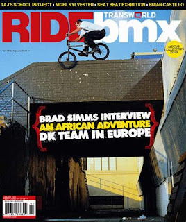
This ride bmx magazine has enforced its message through highlighting possibly the most important word in its title which is 'ride.' This captures the eyes of any potential buyers and also makes the cover interesting to look at. It uses a the technique of centering the plugs in the middle as it is the first thing u glance at when looking at the cover. The text colour used looks almost as if its like a sandwich which is a use of creative and interesting layout design. The proffesional photo of the BMX rider shows that the magazine will be exciting, extreme and also fits in with the cover as it is obviusly a bmx magazine.

I want to base my magazine on a similar them to this guitar world magazine as it has a very interesting design, layout and colour scheme. Also the photos are very professional which show the reader that they mean business. The font styles are also very different and unique. This is definitely the angle i will take when creating my final magazine cover.


Friday, 10 October 2008

magazine cover analaysis


This is the front cover of a magazine for secondary school teachers.
denotation - The image shows a secondary school boy raising his hand, as if he is asking a question. Their is some big blue bold text at the top of the page were the boys hand is piercing through the e and c in the title. Also there are blocks of text around the boy and also at the top of the page in different colours.
connotation- The boy in the school uniform raising his hand suggest that a question has been raised that will be answered within the magazine article. This technique draws in the audience as they want to know the answer of the question. The title at the top of the page is designed well because it instantly lets the target audience know that is for secondary school teachers. Also the blue is quite calming and easy on the eyes and suggest to the readers that it is possibly an easier read.
The Language is informal and includes many different text sizes and colours.

Monday, 29 September 2008

Foundation Portfolio - Preliminary task

Producing a college magazine front cover and contents page.

As this is the beginning of the foundation portfolio preliminary task we looked at how the key media aspects could be applied to produce a front page of a college magazine to the best of our ability. We used the acronym - LIIAR - which means Language, Institution, Ideology, Audience and Representation. They could be applied to my project in this way:

Language - The print layout (involving text). Formal or informal language, font, text colour, logo creation, images and proportion.


Institution - We control the production process. We can choose the content inside the magazine (layouts logos etc) The Storys come from Wyke!


Ideology - Respect, equal treatment, opportunity and great belief in education.


Audience - The magazine Will be aimed at all wyke students, age group 16 - 19. 64 percent of which are female


representation - Storys contributed by the students will be represented in the magazine. Type face and choice of photo also play an important part