This is heat magazine which
is about celebrities and shocking
storys. The magazines unique selling point is that is takes celebrities and exposes them to make the audience feel better about them selves. It uses informal language so that the audience target audience can relate to it. Also it uses plugs in the form of stars to sell itself and also has big bold red titles for an eye catching effect. This magazine has used a professional photo to use on the cover of charlie from big brother who was in the public eye at the time.

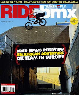
This ride bmx magazine has enforced its message through highlighting possibly the most important word in its title which is 'ride.' This captures the eyes of any potential buyers and also makes the cover interesting to look at. It uses a the technique of centering the plugs in the middle as it is the first thing u glance at when looking at the cover. The text colour used looks almost as if its like a sandwich which is a use of creative and interesting layout design. The proffesional photo of the BMX rider shows that the magazine will be exciting, extreme and also fits in with the cover as it is obviusly a bmx magazine.
I want to base my magazine on a similar them to this guitar world magazine as it has a very interesting design, layout and colour scheme. Also the photos are very professional which show the reader that they mean business. The font styles are also very different and unique. This is definitely the angle i will take when creating my final magazine cover.


